Homelink
Beijing, 2011
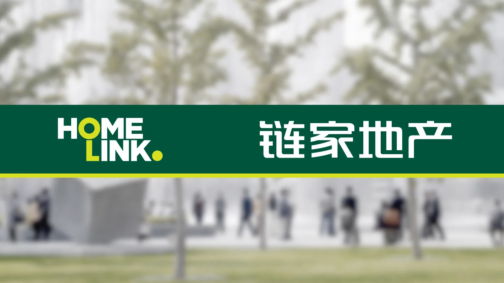
Beijing’s streets were crowded with real estate agencies, each storefront competing for attention with the same visual codes, the same signs, the same noise. Homelink was still an average-sized player, but its leadership had no intention of remaining one.
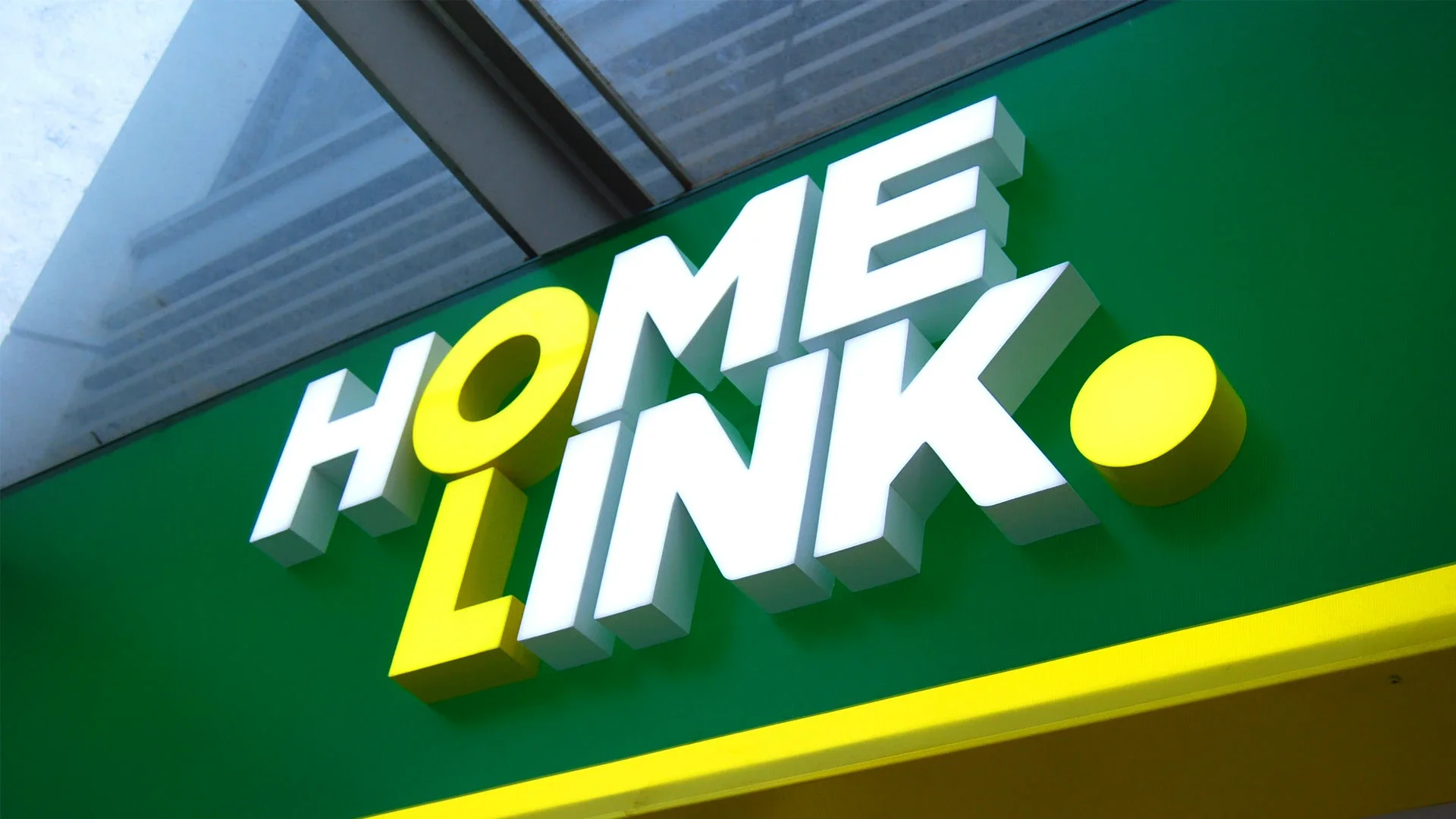
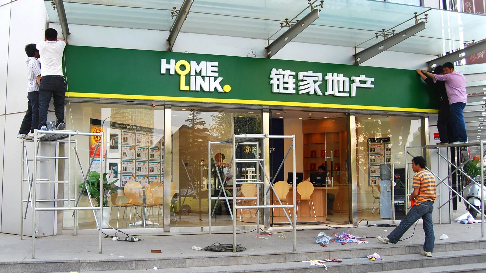
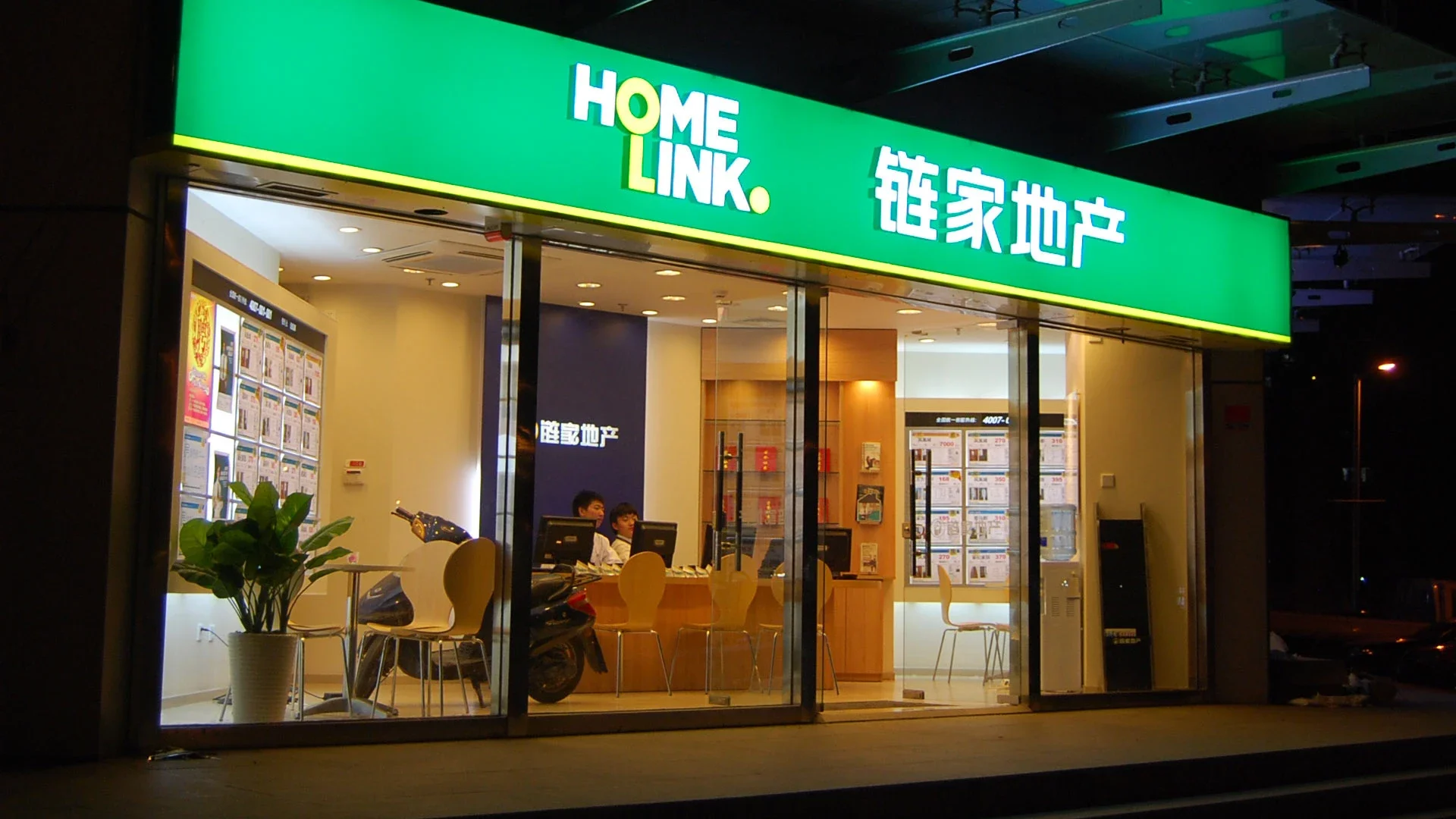
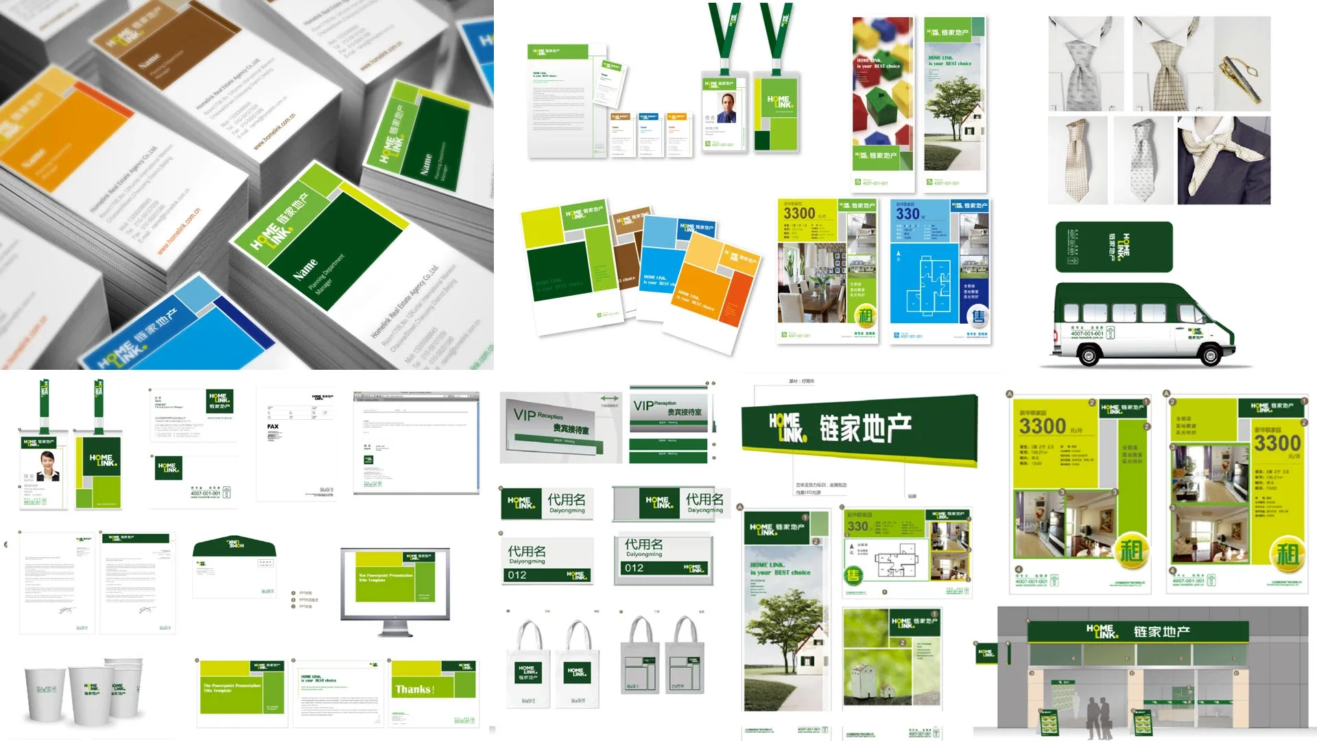
They wanted an identity that would break through instantly and signal far greater ambition. Instead of treating the logo as an isolated object, we focused on the real battlefield: the storefront itself. The very next day, we returned with a bold direction built around a deep green and lime palette, designed not simply to look good, but to transform visibility at street level.
What struck me most was how often branding in such markets becomes trapped in repetition. Everyone tries to appear credible by resembling everyone else. We chose the opposite path. Differentiation had to be immediate, physical, and impossible to ignore.
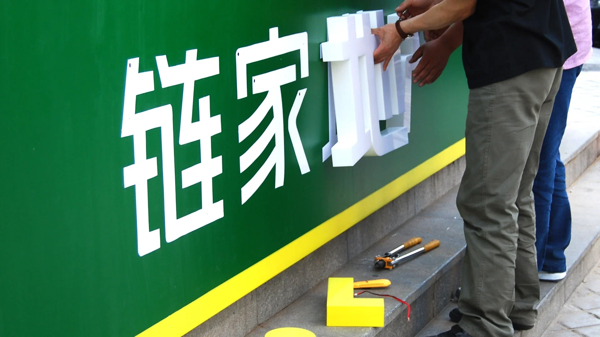
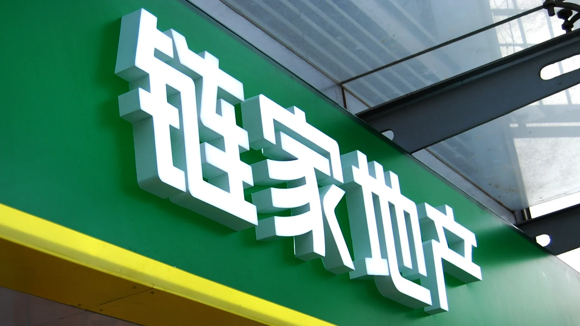
Once the decision was made, the energy shifted. With precise coordination between our team and the sign-maker, storefronts across the country were replaced within a single month. The change was not subtle. Homelink suddenly looked like a company that already belonged at the top.
Six months later, Homelink became the number one real estate agency in China, and a national benchmark proving that when design is applied with clarity and conviction, it can reshape not only perception, but position.